Fluid Identity and the Value of a Logo
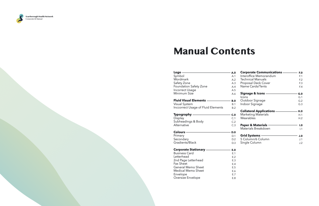
For the corporate identity course I took, I had to pick a public sector organization and redesign their identity, creating a manual for it as the final deliverable. Through this project, I learned about the power of a logo and how it directs the whole identity. I learned how to incorporate its design and meaning into materials that make up the organization and the conventions of different materials. This was easily the largest project I have worked on for school aside from my thesis project. However the bulk of it goes into all the materials and content in the manual, derived from the logo and accompanying fluid elements, and built from conventions that I learned as I went about making mockups for each piece. It is because of this that I say that the logo development was the hardest part. So much effort went into figuring out how to best represent Scarborough Health Network in a way that looks appealing, is informative, and is memorable. I cannot say whether my design achieves these goals or not, but the design is developed with these in mind, sculpted around the organization's values in inclusivity and accommodation.
Full PDF
Process Work